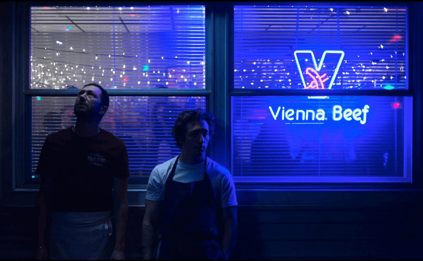
No lighting designer passing by The Original Beef of Chicagoland by chance—perhaps in a fit of stress eating after getting lost in Chicago’s less glamorous neighborhoods—would think that the lighting in that restaurant is appealing to customers. In fact, even a budget lighting designer would have designed it differently, with a little more ambition.

And yet, it is precisely the lighting in Carmy’s restaurant and the cinematography of The Bear—already a cult FX series in an era of AI-perfected mise-en-scène—that stand as a testament to art-house-level quality. The series’ aesthetic, crafted by cinematographer Andrew Wehde, is built on cold neon as a nervous system and the kitchen environment as the characters’ body. That’s why the lighting in The Bear is one of the most animalistic and vibrant things we’ve ever seen.
A dual palette: cold and warm
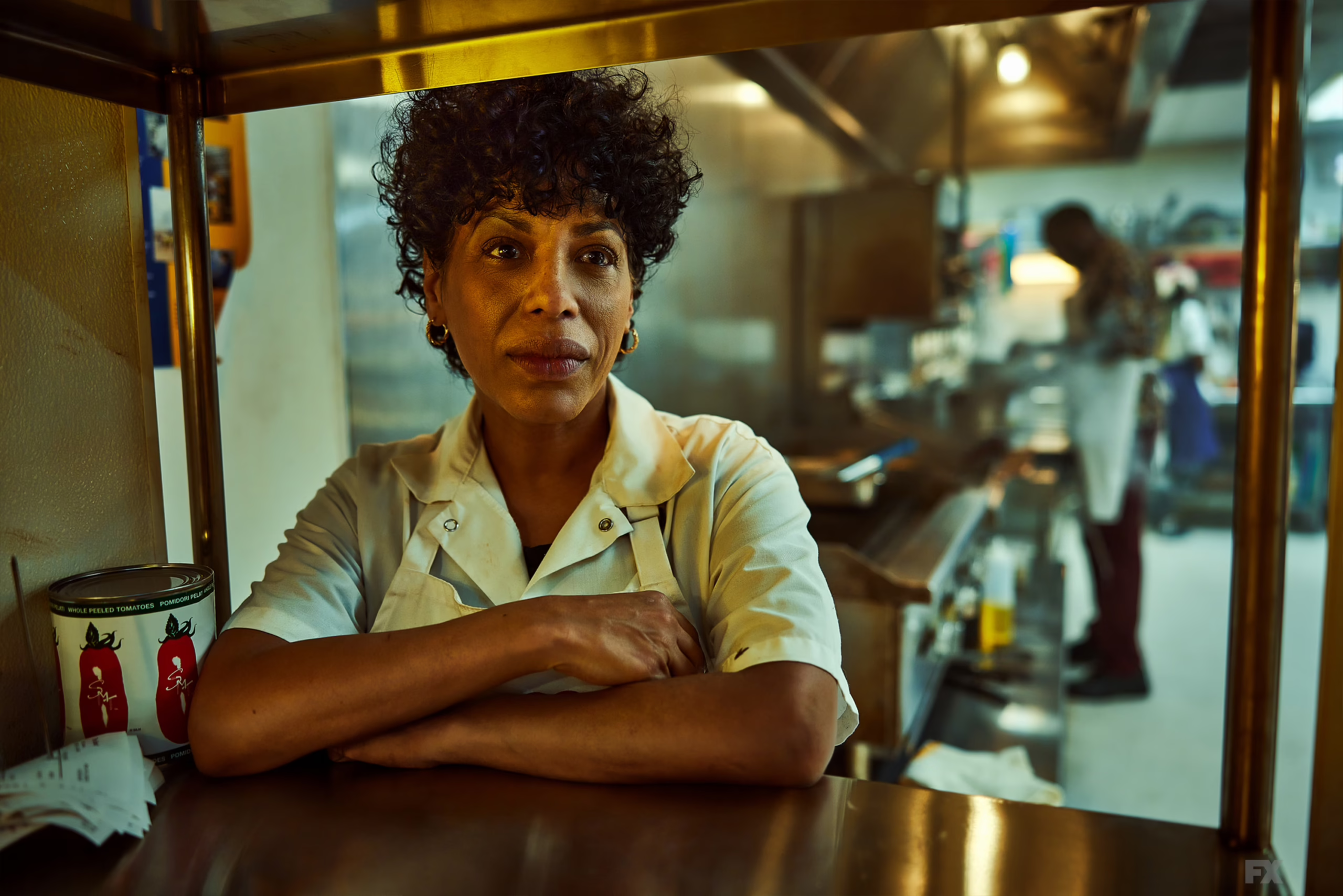
The aesthetics of The Bear evolve alongside chef Carmy Berzatto’s obsessions, strictly in binary code: steel versus amber.
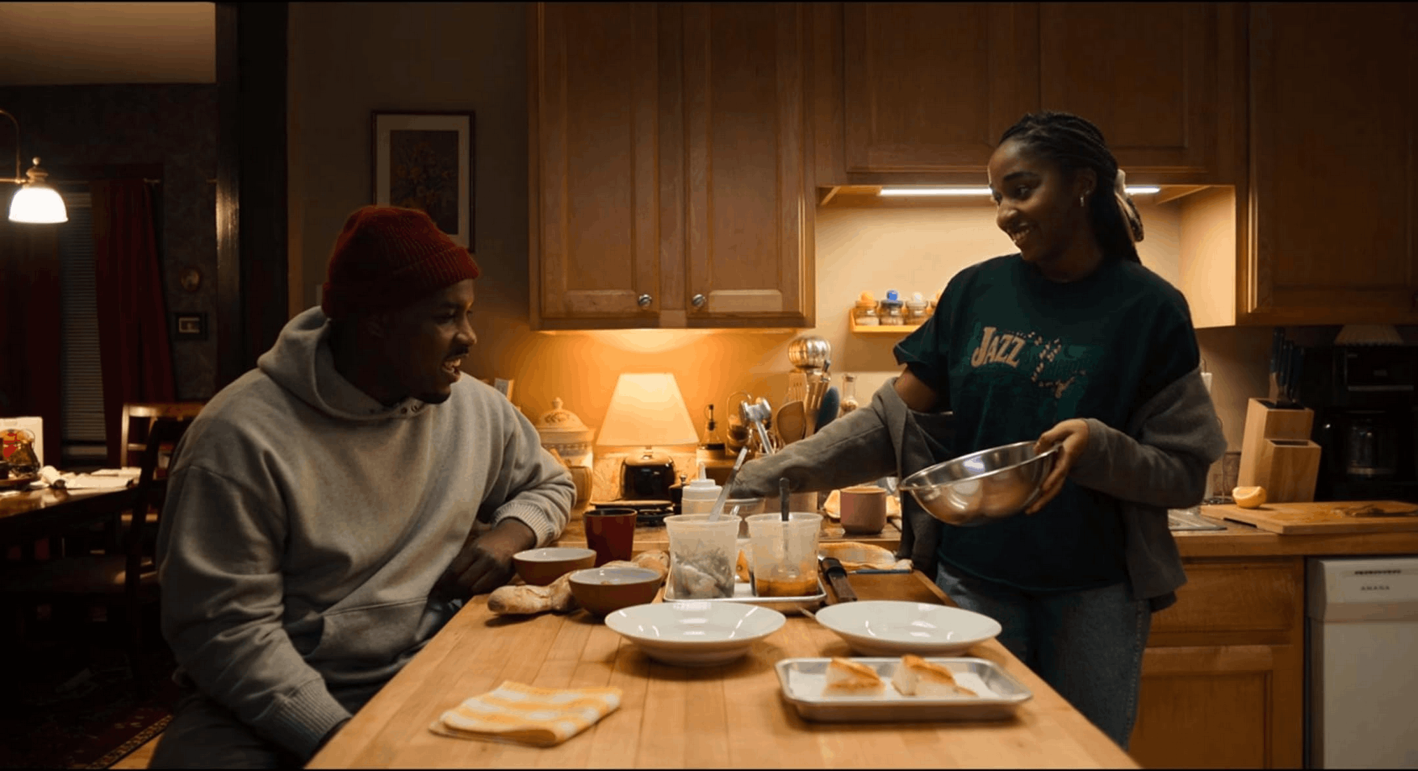
It’s not hard to notice how the kitchen is characterized by a frozen, angular light—bare and raw—dominated by non-colors: stainless steel, the off-white of the surfaces, and the muted blue of the uniforms. In contrast, the intimate scenes in which the characters leave the workplace and live not as chefs but as human beings are dominated by a golden light—slightly crisp, seemingly reassuring, yet far more subtle in bringing traumas and turmoil to the surface.
Carmy’s color code
In reality, the visual language of light in The Bear is so powerful that it subverts perceptions through the force of the narrative: the warm, enveloping light belongs to family arguments, while Mikey’s amber-hued memories evoke mourning. You can’t rely on the traditional color code (warm = welcoming, cold = hostile), because in this universe everything is different—warmth burns and cold protects: the temperature of discipline is the only order Carmy knows.
From the pearl gray of fine dining to the film of the “Gary” episode
With the rise of fine dining—which might make our lighting designer, who got lost in Chicago, a bit more receptive to the restaurant’s lighting choices—the color palette grows even cooler: the pearl gray of the Michelin-starred dining room represents the rise and triumph of ambition. And in the episode “Gary,” shot on film, there’s a grainy, almost sepia-toned warmth that portrays the past as a physical reality, without the (now ubiquitous) nostalgic filters.
Neon and RGB LEDs separate reality from fiction
The cinematography of The Bear and its lighting system rely on radical choices. There are no external light sources on set, only practical lights: every lamp in the restaurant is an RGB LED controlled by a dimmer-board operator. This signifies something—namely, that The Bear does not use artificial lighting but only diegetic lighting, and the light we see is the light the characters turn on, endure, and struggle to pay for through their utility bills.
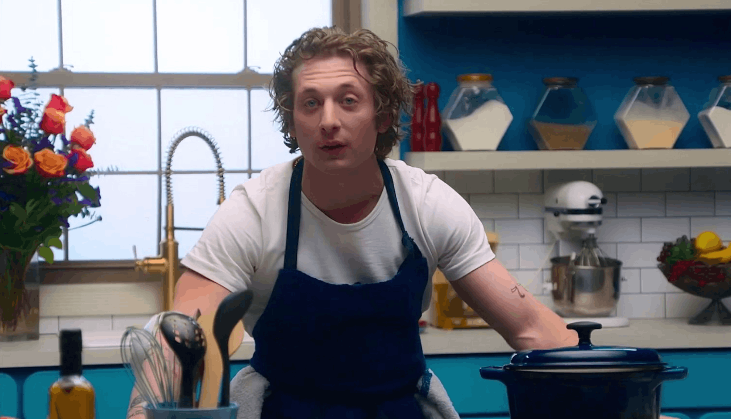
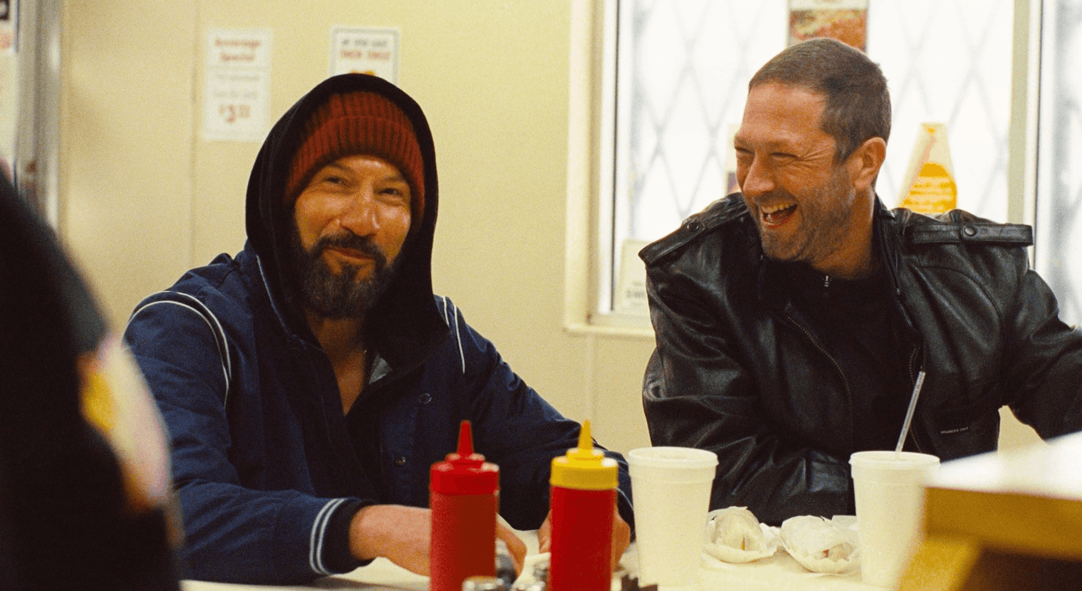
When working with shadows, the approach is one of “physiological expressionism.” “Much of the series is shot extremely close to our faces. This, as an actor, really allows you to seek out an inner life and trust that the camera is an extremely sensitive tool. If you’re feeling something, the camera will capture it,” Jeremy Allen White revealed to the Associated Press. The series was shot digitally on an Alexa Mini LF, and the vibrant texture that makes the characters feel so close to us stems from the decision to push the ISO (i.e., the sensor’s sensitivity to light) up to 3200, the absolute limit.

The demise of food porn. Food is a blend of matter and sweat
The Bear shatters the icons of culinary television, starting with the catchphrase “food porn.” For once, after years of “cookwashing” amid fragrant basil plants, overly red tomatoes, and well-placed spotlights, food is no longer a beautiful object of desire, but one of hard work… capable even of arousing disgust. Even the cinematography follows this principle, breaking the mold and offering us a new perspective—one that extends beyond The Bear to rethink Instagram profiles, cooking shows, and cooking demonstrations at luxury events with a different mindset.
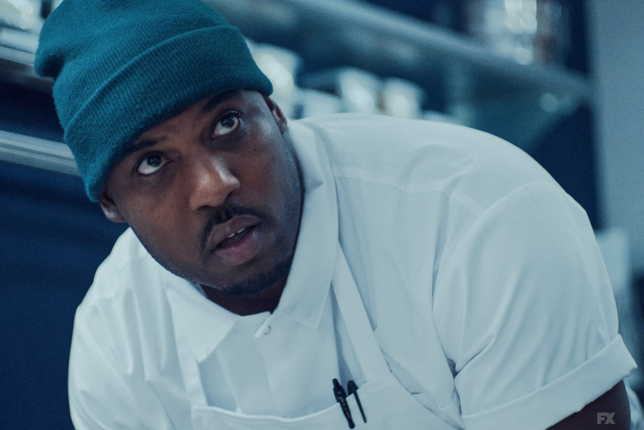
Cooking isn’t about beauty—it’s about sweat, the very same sweat shown by the glistening droplets on the faces of Carmy’s team, which seem almost within reach. “The skin [of the characters in The Bear, ed.] appears dreamy and creamy, while the eyes remain incredibly sharp, and the light in their eyes stands out perfectly,” Wehde told Go Creative Show.

The Bear’s anti-luxury aesthetic becomes a new object of desire
In an age of control, The Bear chose chaos. It embraced controlled overexposure and neon lights to guide the characters per aspera ad astra. Paradoxically, this anti-luxury aesthetic has become the most desirable image on contemporary TV and the symbol of the sexy icon Jeremy Allen White, who starred in a sizzling Calvin Klein campaign shortly after the series aired.