Cover photo: Courtesy Netflix
Netflix’s Wednesday series, centered on the braided Addams girl, explodes like an ink stain in a streaming era oversaturated with hyperpop colors. Tim Burton, who directed several episodes and shaped the show’s aesthetic, has never been one to follow trends. If anything, the opposite is true: fashion bends to his imagination, markets tune their colors to his palette, and narratives shift to orbit his eccentric universes.

In his world of dark fairy tales, washed-out tones and deep shadows become an art form just when glitter, Barbies, Pokémon, flamingos, and champagne dominate elsewhere. Burton breaks in and breaks the mold, with the style that made him a legend. In 2022, the debut of Wednesday was celebrated as both a global phenomenon and a cultural revival, thanks in part to its distinctive photographic direction and use of color. Here, black is not just a vintage flair,but a visual and political manifesto—today’s anti-mainstream that shapes tomorrow’s trends. The Addams legacy infiltrates how we think, dress, decorate, and dream.
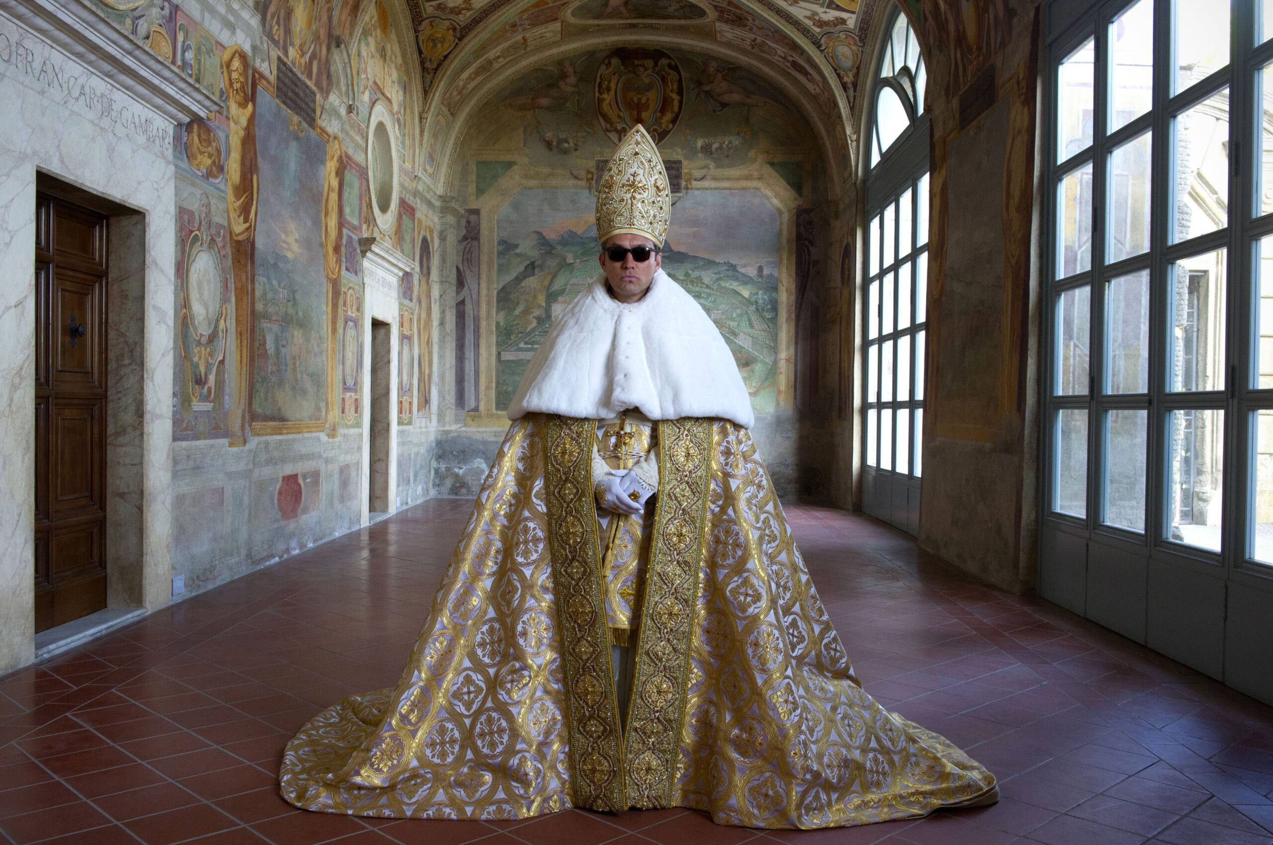
It’s no coincidence that in 2025, while Wednesday continues to exert its aesthetic and cultural influence, Florence celebrates Tim Burton with the exhibition “Tim Burton: Light and Darkness.” Curated by Sarah Brown in collaboration with the Florence Biennale, the exhibition was specially conceived for Florence and will be held from October 18 to 26 at Fortezza da Basso. This immersive experience brings the director’s universe to life through more than fifty works, including drawings, installations, and visionary creatures. Moving between light and shadow, melancholy and irony, the exhibition demonstrates how Burton’s dual poetics — the same ones present in the series — reshape the codes of the contemporary sublime.
A timeless gothic aesthetic
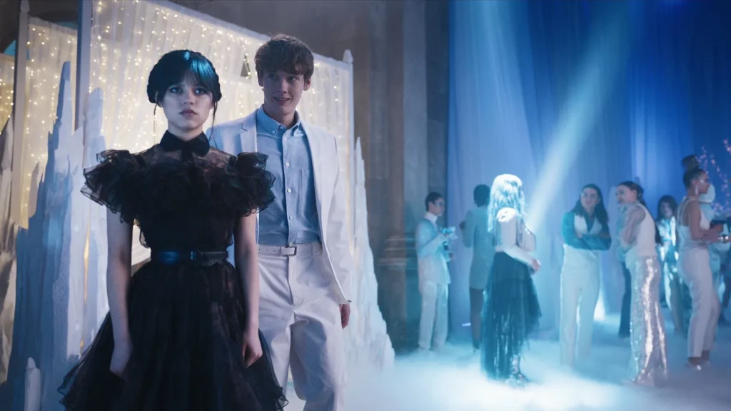
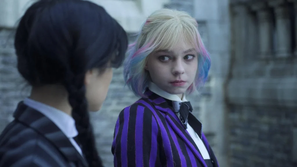
In an era where the Pantone Color Institute sets the aesthetic rhythm—from “Peach Fuzz” to the recurring Millennial Pink—Wednesday proposes a whole new chromatic agenda. And rightly so: no one expected reassuring palettes from an Addams spin-off. This world is carved in black, white, and violet, with a protagonist immune to the seduction of algorithms. It’s precisely this subtraction, this refusal of seasonal trends, that makes her powerful: an icon out of time.
The show alternates between natural and artificial light: outdoor scenes are filtered through milky skies, while interiors are modeled by concealed and directional sources that sculpt corridors and faces in chiaroscuro.
The color grading, done by Company 3, intensifies this effect: some hues are isolated and saturated to the point of looking engraved. Think of the deep red velvet of the Addams limousine seats or the autumn leaves in Jericho—standing out like slashes of pigment in a tableau otherwise drowned in shadow. Every color detail becomes a brushstroke that amplifies the girl’s black-and-white silhouette.
Black and white vs color: Wednesday between two worlds
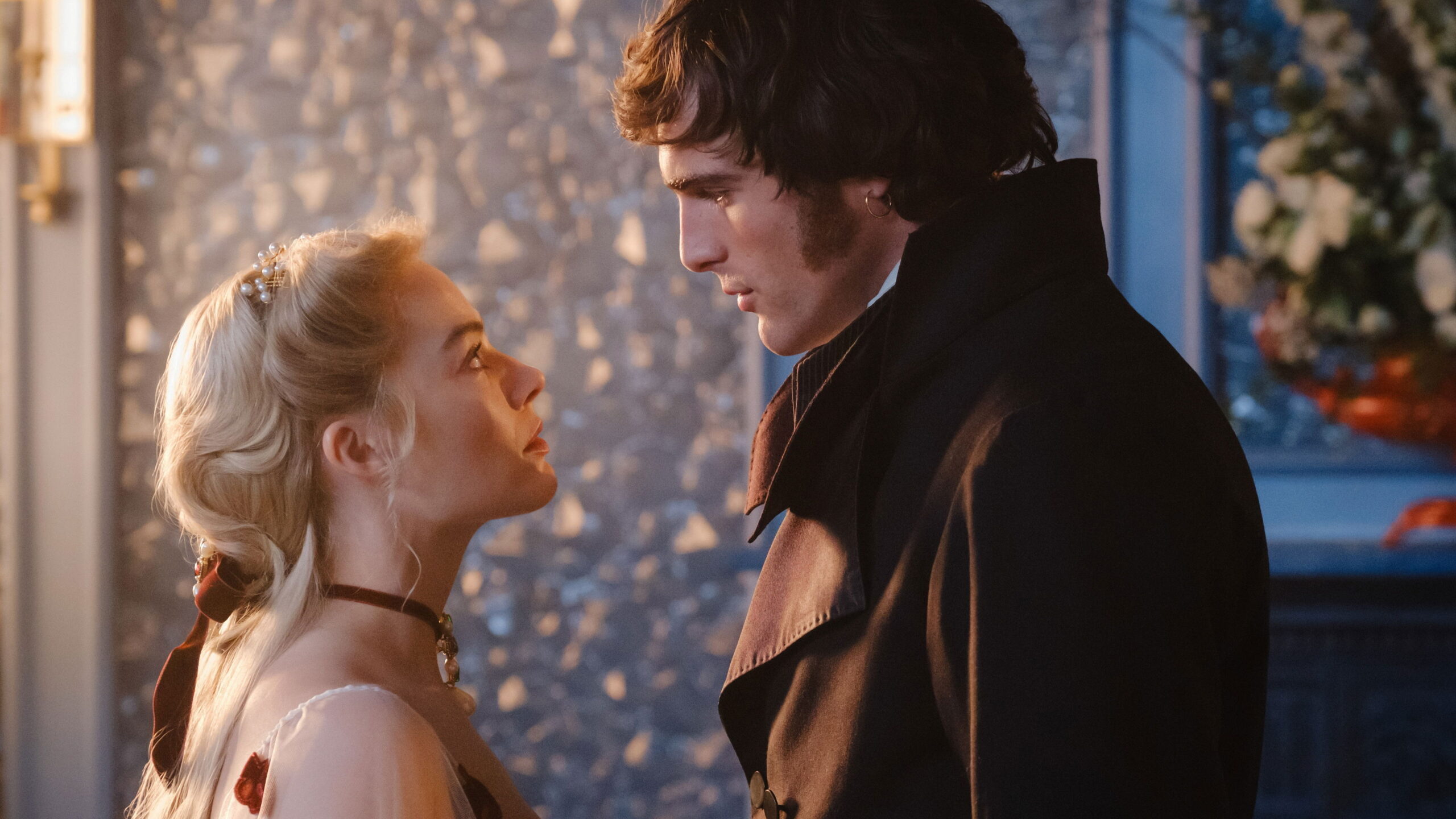
Within the gothic walls of Nevermore, cinematography takes on a multi-layered dimension: shadows thicken, harsh contrasts sculpt faces like wax statues. David Lanzenberg, cinematographer for the first four episodes, used ARRI’s Orbiter lights to create moonbeams through Wednesday’s window, turning the room into a surgical aquarium of cold light. Elsewhere, SkyPanels hidden under floorboards or behind walls simulate fake flames, guiding actors with invisible fire. This creates a natural visual choreography, where the actors are drawn toward the brightest spots.
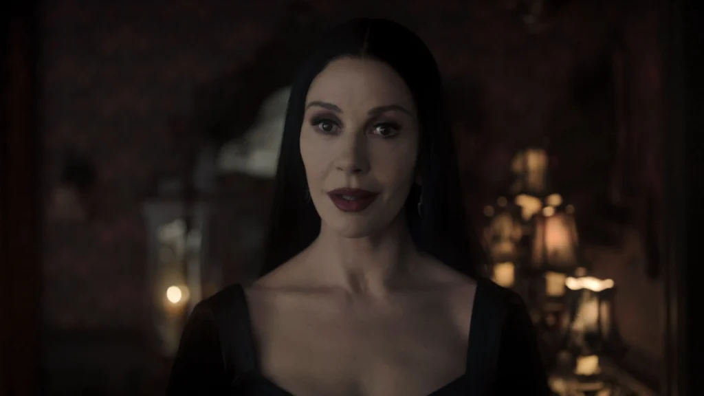
Senior colorist Siggy Ferstl designed a custom LUT (look-up table) that gives Wednesday a porcelain complexion, further emphasizing her role as a visual outsider. Alongside black and white, violet appears again and again—the color of Nevermore, used not to brighten the frame but to deepen its mystery.
Meanwhile, the town of Jericho explodes in almost artificial saturation. Every sign or autumn leaf glows too brightly. Some Reddit users even claim it’s the same (repurposed) set as Gilmore Girls’ Stars Hollow. But that’s the point: in this clash between shadows and glares, Wednesday finds its identity. Jenna Ortega’s glacial gaze and monochrome wardrobe always mark her as a foreign body—bringing night into the brightest days. In the “Wednesdayverse,” light is not just a technical element; it becomes ambiance, a vital force, and an inner conflict.
Tim Burton’s goth moodboard: melancholy as pop beauty
Tim Burton’s gothic aesthetic in Wednesday is a familiar constellation: the trimmed gardens of Edward Scissorhands, the poetic shadows of Vincent, the macabre wonder of Nightmare Before Christmas—these are the (in)visible Easter eggs throughout the series. Slender figures, elongated silhouettes, oversized eyes glowing in the dark—every detail channels a visual language that turns fragility into magnetism.
These codes return in full force: Nevermore’s shadow-carved corridors, Jenna Ortega’s portrait-lit close-ups, black-and-white flashbacks echoing Burton’s early experiments. The cinematography gives Wednesday its sophisticated visual brand.
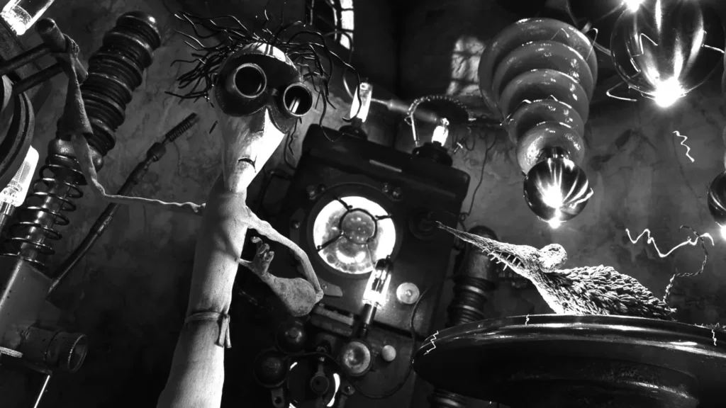
A stop-motion heart: the Vincent homage
Season two takes us back to Burton’s origins with a stop-motion flashback in black and white, reminiscent of Vincent’s early melancholic sketches. A mechanical heart that beats and breaks, a fragile genius doomed to self-destruction.
An aesthetic destined for martyrdom. It’s in these moments that Burton’s true lesson emerges: melancholy isn’t a flaw, it’s an aesthetic force. A pop iconography. A universal key. He’s always turned darkness into design, and thus the outsider into an influencer.
Wednesday is a shadow that shines: she doesn’t try to match the world’s glow but recolors it with her own darkness. That’s how the different girl becomes an icon—not with reflective surfaces, but with the silent strength of shadow.